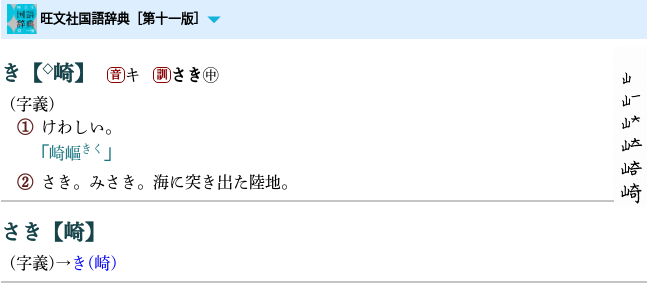
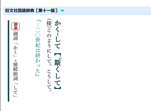
把笔顺调到最右边。
只有五笔画的字,
两岸及日本三地写法都不一样。
很有意思。

.图像 {
display: inline;
float: right;
}img.hitsujun {
/* display: none; */
/是否显示笔顺/
width: 25%;
float: right;
}
span.exp {
margin-top: 0.2em;
display: block;
}
最后请教一下,
border 上方和文本间的空白特别大,
这个 css 有办法调吗?
把笔顺调到最右边。
只有五笔画的字,
两岸及日本三地写法都不一样。
很有意思。

.图像 {
display: inline;
float: right;
}img.hitsujun {
/* display: none; */
/是否显示笔顺/
width: 25%;
float: right;
}
span.exp {
margin-top: 0.2em;
display: block;
}
最后请教一下,
border 上方和文本间的空白特别大,
这个 css 有办法调吗?
Displayed somehow better here in GoldedDict Qt5.
Did you add both two float in css?
I saw something similar to yours with only one float (can’t remember which one).
The two floats are present. I am using the xiaoyifang fork that also runs with qt5.
Maybe you can test with only one float.
Try to see which get best result.
Unfortunately, this doesn’t improve anything. Would you mind sharing your css? I have tripled checked my css based on your post, could it be possible you have done further editing to the css that you haven’t posted? You are using a custom css addon-style that affects rendering (I have already tried turning my style off on my end)?
Here you are.
OBS.zip (1.5 KB)
mdx is from 开心最重要 modded version.
I have all the same files but it still overlaps to some degree.

I do not know much css but from what I understand this is caused by the float function which causes overlapping and isn’t able to add padding below itself. (I have tried to fix it but my knowledge is quite limited and searching online doesn’t seem to come up with a solution)
It’s not that big of a deal I will just have to bear with overlapping.
Excuse me for the trouble caused!
what’s meaning that you said the image is overlapping
The syntax might be better if you typed: “What do you mean by saying that the image is overlapping?”
你没看见图片里的“崎”字和线重叠了?
You can try to scale down the image.
img.hitsujun {
/* display: none; */
/是否显示笔顺/
width: 25%; /*<=============== use smaller number*/
float: right;
}
If the stroke order image is too large it goes over the next entry below.
In my example it’s more noticeable because I use a custom css in goldendict to have a line between entries.
Like First_Last said, a fix could be just resizing the image to a smaller size.
Another way is to process the images and rearrange the words in landsape (horizontal) direction.
can you send that vertical version of reikoku?
Check #52 in this topic.
thank you
edit: i had to add the following code at the top of the css file:
body {
    writing-mode: vertical-rl;
}

感謝樓主,可為什麼文件有mdd,導入歐路卻沒有