日本国語大辞典 第二版 - 清洁CSS

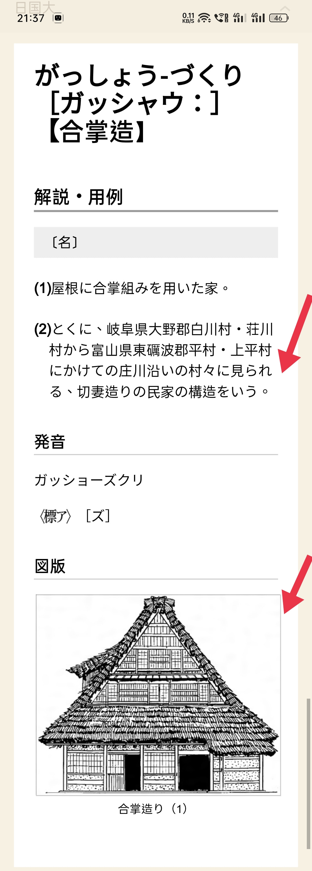
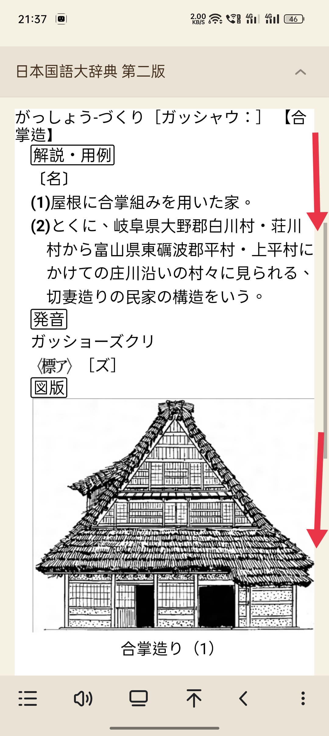
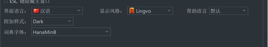
This dictionary looks extremely out of place placed along other dictionaries. For this reason I have created a custom css with the purpose of making the layout much cleaner.

Machine translation:
这本词典和其他词典放在一起看起来极不合适。出于这个原因,我创建了一个自定义css,目的是使布局更清晰。

Version 2.0:
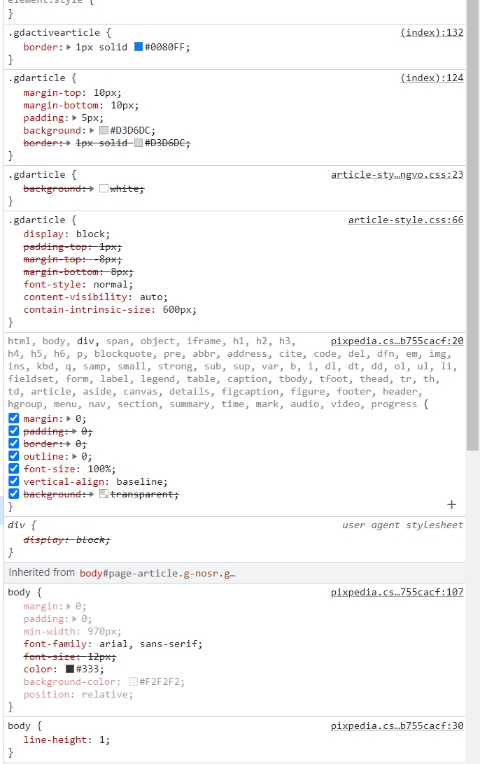
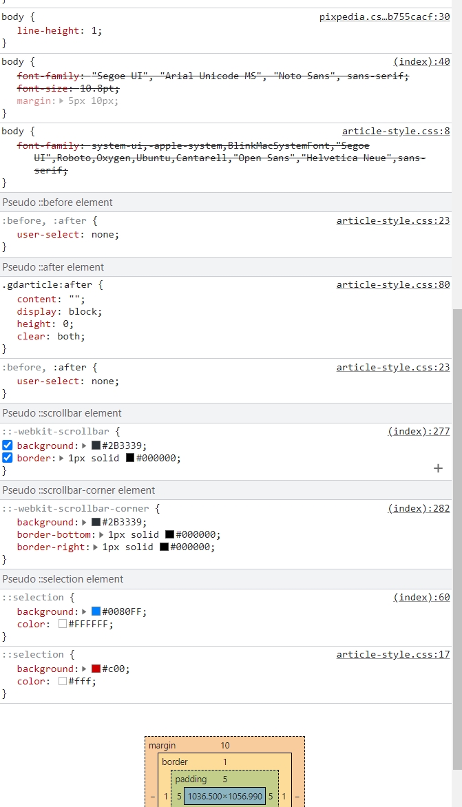
I have optimized the css file by removing 4,064 lines that are not actually used in the dictionary (from 4,866 lines to 802 lines). This greatly improves the loading of the dictionary. I have checked if this doesn’t cause any issue and every thing seems to be working correctly.
版本2.0:
我已经优化了css文件,删除了字典中实际未使用的4064行(从4866行到802行)。这大大改进了字典的加载。我已经检查了这是否不会导致任何问题,并且每件事似乎都正常工作。

Original/起初的:

Custom/风俗:

12 个赞

Thanks for sharing. I like the compact style.

2 个赞


This css is easy to use, here is a bug to report, in the mobile phone browsing, the right side of the display will be too narrow, hope can fix it.

1 个赞

I’m sorry I don’t understand what the issue is.


A little strange

啥意思啊,右侧太窄了什么啊看不懂

1 个赞

In eudic app,here is original mode


It can display correct distance in right side .
In custom mode

This distance disappears.

Very strange, I do not have this issue.

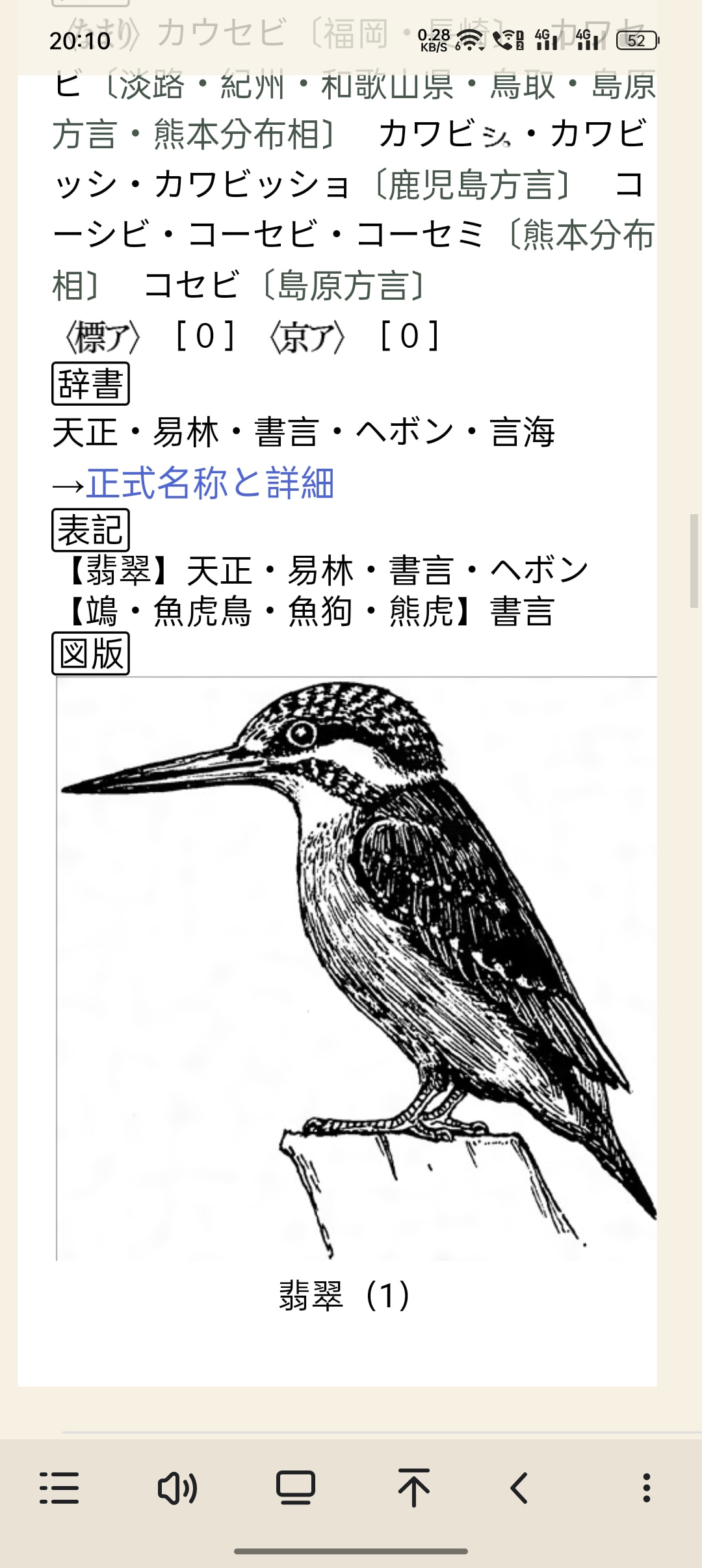
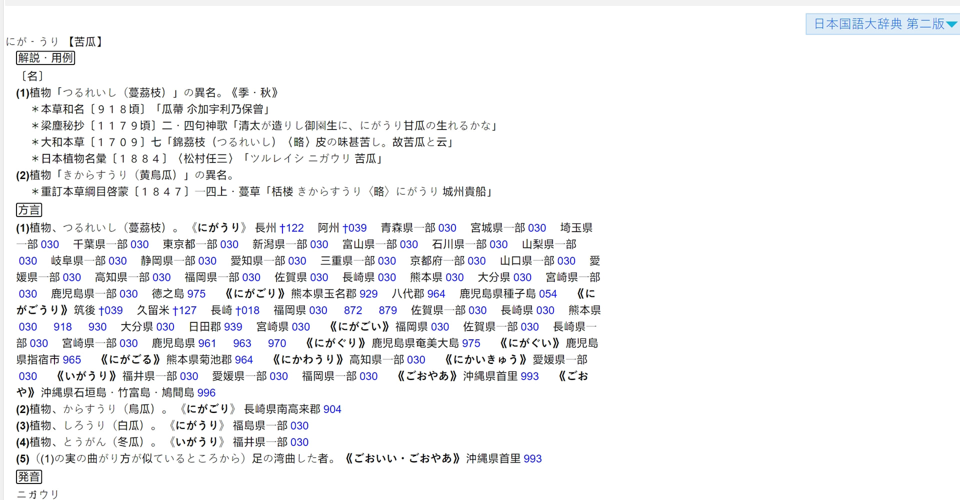
If you’re talking about the padding on the right then it is on purpose. The definitions are very long and I’m trying to have as much text as possible visible on screen. I have kept padding on the left because without it, it is harder to make out the different sections of the dictionary.

3 个赞

Maybe the problem is the display resolution

Wow, I am not getting that at all. Do you use a custom goldendict style?

just dark mode,disable it also strange。

1 个赞

If you right-click on the blank space then inspect element, what does it say?


No error

基于楼主的版本,我做了一个相对更精致一点的改版:
I’ve made a new CSS based on your version:


对比楼主的版本:

11 个赞

不同颜色,十分美观。感谢制作,感谢分享。