
怎么写
不是完美复刻,大概像这样:
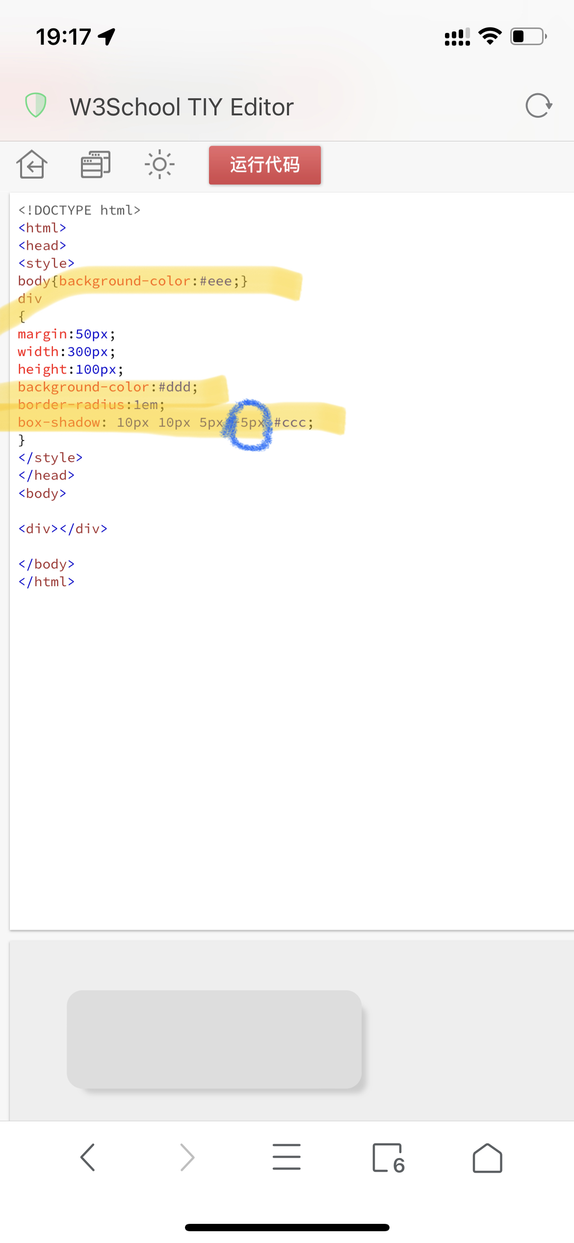
<style>
div {
    width: 400px;
    height: 250px;
    border-radius: 15px;
    background-color: #e0e0e0;
    box-shadow: 1.5px 1.5px 3px -1.5px #c1c1c1;
}
</style>

<div></div>
请问这个图来自何处?
一楼吗?。电视遥控器app
安卓上好像有个美化,就是这个调调,//更新找到了。
KWGT
CSS box-shadow: What is the difference between blur and spread?
CSS Box-Shadow: blur, spread, inset, multiple and one side shadow
First of all, there are six properties in CSS box-shadow: offset-x, offset-y, blur-radius, spread-radius, colour and inset. The writing order is like below.
{ offset-x offset-y blur-radius spread-radius color }
or
{ inset offset-x offset-y blur-radius spread-radius color }
When I first read these properties, I was very confused what is the difference between blur and spread. So I tried to write it down like below in the Codepen.
都闪开,专业选手来了!!!
这种设计风格叫做Neumorphism,这个网站可以自动生成CSS代码
1 个赞
404 error
再试试,之前论坛编辑器自动把url变成链接了,所以就出错了
1 个赞
爱了爱了
你真棒